Photo by James Nachtwey for TIME magazine.
I will never forget staring at the screen. I was stunned. It was just a few moments after I got the phone call to turn on the TV. Then the second plane hit.
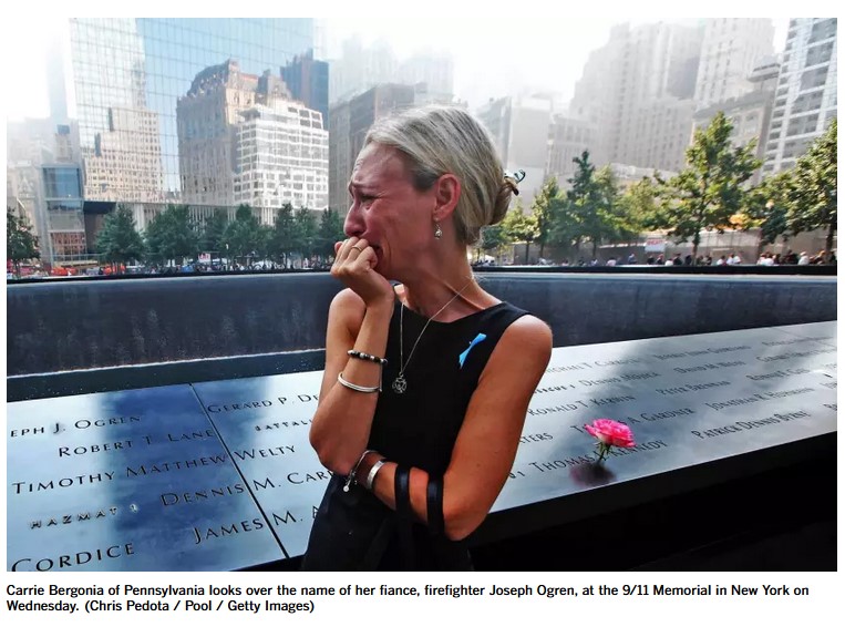
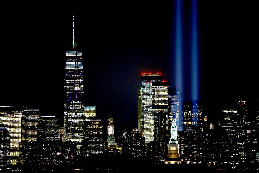
On this date, twenty-one years ago, we experienced a great national tragedy in the United States. 2,977 lives that were lost in the terrorist attacks. So many families were torn asunder. The way we view ourselves and our world changed. Emergency responders continue to suffer terrible health problems as a result of working at the scene. The way we view ourselves and our world changed too. Over 2,000 first responders have died of health issues related to 9/11.
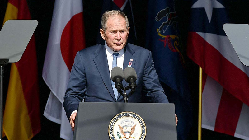
In remembrance of that day, and to honor the lives that were lost, I am posting some tributes.