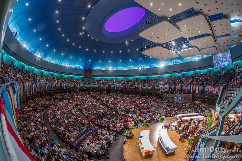
The Conference Chamber, The Auditorium, Independence Missouri. My favorite image of the morning.
I was photographing a Communion service at a church conference in Missouri using two DSLR cameras and an iPhone. All told, during this one service and the short time before and after, I created 354 images. So how many “selects” did I pick? When an editor asks you for “selects” from an event, that means they want your best images in chronological order. The editor will narrow that down even further when deciding which images to publish. Several photographers were covering this event as a team so I didn’t have to worry about capturing everything. This article explores the selection process between taking the photos and the final published images.
Total images per camera.
Canon 5D Mark III: 139 photos
Canon 7D Mark II: 188 photos
iPhone: 27 photos
Lenses.
On the Canon 5D Mark III I used three lenses. Most of the time it was a Canon 24-105mm lens. If I really needed something wider I would switch to a Canon 17-40mm lens or a Canon 15mm lens (which I used for my favorite image of the service). On the Canon 7D Mark III I used a 70-300mm telephoto zoom lens all the time.
Why two cameras with lenses? If you are using one camera, you miss too many good shots if you are changing lenses while something important happens.
So how many selects/keepers did I end up with?
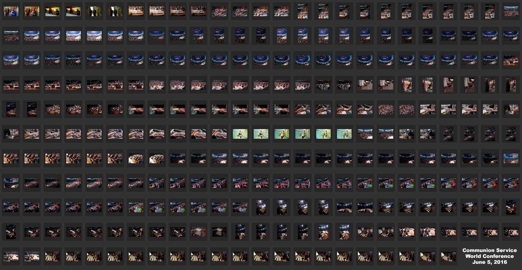
All 139 Canon 5D Mark III photos. Click the image to see a larger version.
To keep this simple, let’s look at just the images from one camera, the Canon 5D Mark III. This screen capture (above) has all 139 photos that I created with the 5D3. When I went through all of the images, I picked 42 unprocessed selects and sent them to the editor to provide a quick preview of what I had. Sending unprocessed files to an editor is unusual, but I have a special relationship with this editor. Then I cut that number down further and picked 13 selects that capture the essence of the event. Then I processed the 13 selects to optimize them for printing and sent them to the editor. With most other editors I only send optimized images. Why “optimize” your images? Read this article. It is also at the first link in the links section.
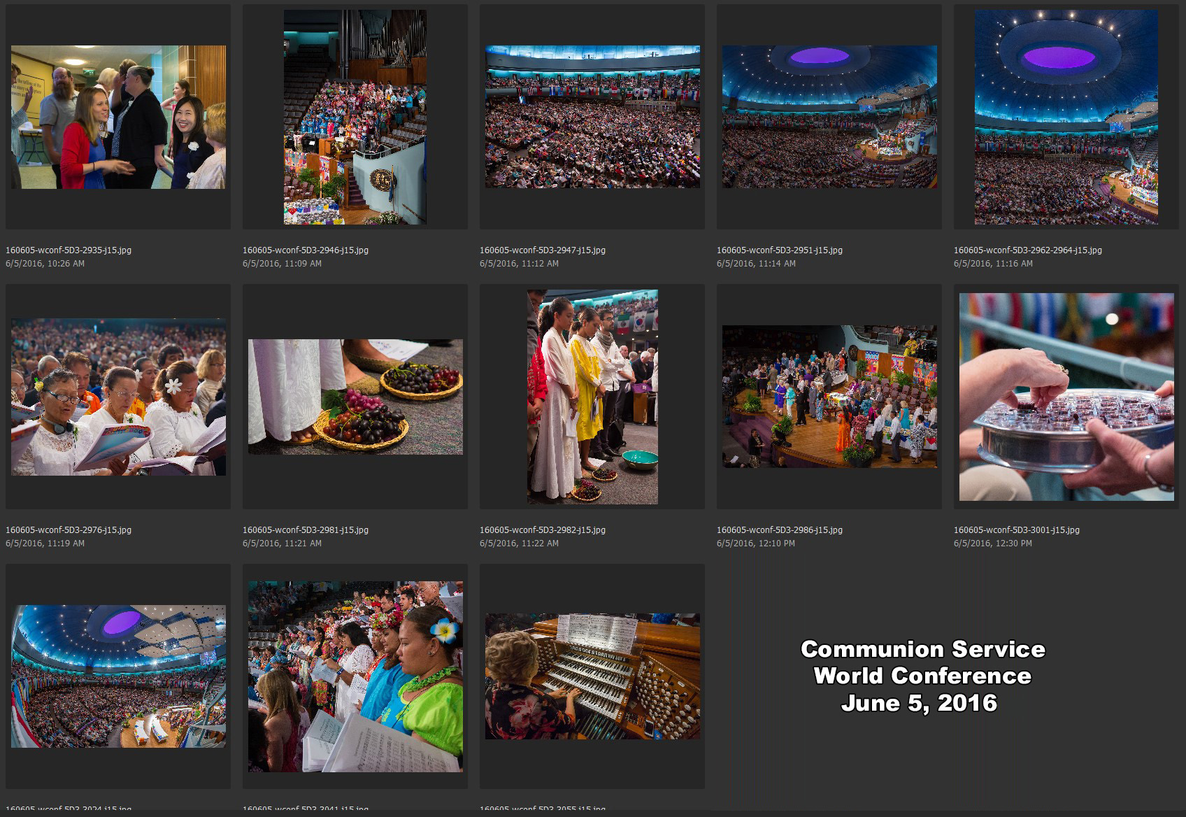
13 Selects, Canon 5D Mark III. Click the image to see a larger version.
First I will cover the technical details of my favorite image, and then discuss some of the selects in chronological order.
My favorite image.
To create my favorite image at the top of this page, I was on the very front corner edge of the balcony. To get an idea where I was, if you look at the top right corner of the U.S. flag on the opposite side of the room, that is exactly where I was, but on the near side of the room. I was using a lens that has a sweeping 180° diagonal angle of view. The ISO was set at 1600 and the aperture was at f/11 to give me a lot of near-to-far depth of field. The shutter speed was slow at only 1/13 second, which is really too slow for a camera without a tripod. I was braced against the hand rail as a tripod substitute to give me some extra stability and a sharp photo.
A chronology of the photos.
The first photo of the morning is the Communion servers waiting on the ramps outside the conference chamber. It was created at 10:26 am. The choir is singing at 11:09 am but no one is seated on the rostrum. In the 11:14 photo the ministers are on the rostrum.
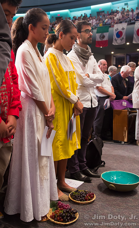
During the first “stand up” hymn I ran down the ramps to get to the main conference chamber floor. I was in the aisle between the rostrum and the first row where Tahitians servers are standing. As much as possible, I prefer to move around the room when people are standing and singing. The grapes at the feet of the Communion servers is one of my favorite unusual compositions. Almost no one photograph’s feet during a Communion service. After I got the images I wanted, I ran back up the ramps to be back in the balcony before the hymn was over.
By 12:10 pm Communion is being served and it is still being served at 12:30. In between I wanted at least one closeup shot of one person taking Communion.
At 12:54 pm the serving of Communion is over and everyone is seated when I created my favorite image of the morning, as discussed above. I wanted to emphasize the flags around the balcony, the sweep and roundness of the whole room, the curves of the ceiling lights, and the nearly 6,000 from all around the world filling the room. This room filled with people is symbolic to me. I wonder what it would be like if everyone from the around the world, no matter their race, creed, color, national origin, religion, or no religion at all, could treat each other with acceptance and respect?
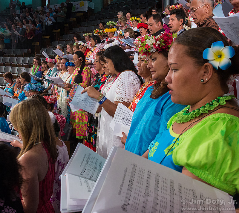
At 1:04 pm the choir and congregation are singing the closing hymn. I wanted to be close to the edge of the choir to take this image. I moved into position while everyone was standing. This is a different look from the 2nd select which has the whole choir from a distance. I like both looks.
At 1:09 pm the organist is playing the postlude as most people leave the conference chamber. I wanted to show her hands on the keyboard, the organ stops, and the complexity of the music.
Communion service photos published.

Selects published.
Four of my 13 selects from this service were published in the Herald, the official publication of the Community of Christ. The editor also published several of my photos from other activities at the week long conference.
The photo that should have been a select.
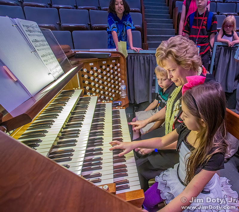
Jan Kraybill shows children the Auditorium organ.
As often happens after a service in the Auditorium, children went up to the organ console after the service to get a closer look. Jan Krabill, the organist, showed the children how the organ works and what the different stops do. In the last few photos, ending at 1:17 pm, two children are sitting next to Jan on the organ bench. In retrospect, I should have picked this image as one of the selects.
Total images versus selects.
42 unprocessed selects out of 139 total photos is 30% of the images. By most standards, that is a lot. 13 processed selects out of the 139 is less than 10% of the images I created. The editor had the option of asking me to optimize additional selects if needed.
To put that all into perspective, Joel Sartore, a National Geographic photographer, says he creates about 20,000 to 40,000 images for a single NatGeo article, and the Geographic editors pick 10 to 20 images for the article. That is a tiny fraction of the total number of photos. Unlike most publications which only want to see your selects, the Geographic wants to see every image the photographers create.
In a way, it doesn’t matter how many images you create to get your chosen images. Dewitt Jones, who spent 20 years shooting for the Geographic, says it well. He is sometimes asked how many keepers he gets on an 8 GB card. Dewitt says that is the “amateur question”. The professional question is, “Did you get the shot?” In other words, the percentage of keepers shouldn’t matter. If you “get the shot”, who cares if it took 1, 10, 100, or 1,000 photos to get it? Don’t obsess about your total shots versus selects ratio. Take however many photos you think you need to in order to have confidence that you get the shots you need. And that will vary with the kind of event or situation.
I highly recommend Dewitt’s 18 minute TED talk which is at the 4th link below.
Links
Joel Sartore on shooting for NatGeo
Joel Sartore – web site
Dewitt Jones, Celebrate What’s Right with the World – 18 minute video presentation.
Dewitt Jones – web site