This tutorial will guide you through the basic color selection tools in Photoshop. Other kinds of image editing software will have a different layout, but similar tools. Before you go through this tutorial, read Learning Photoshop Colors – A Color Picker Tutorial. It covers some Photoshop color information that is basic to understanding this tutorial.
Open up your copy of Photoshop and follow along. You can right click and download the photo at the top of this article to use for this tutorial.
The Basic Photoshop Layout
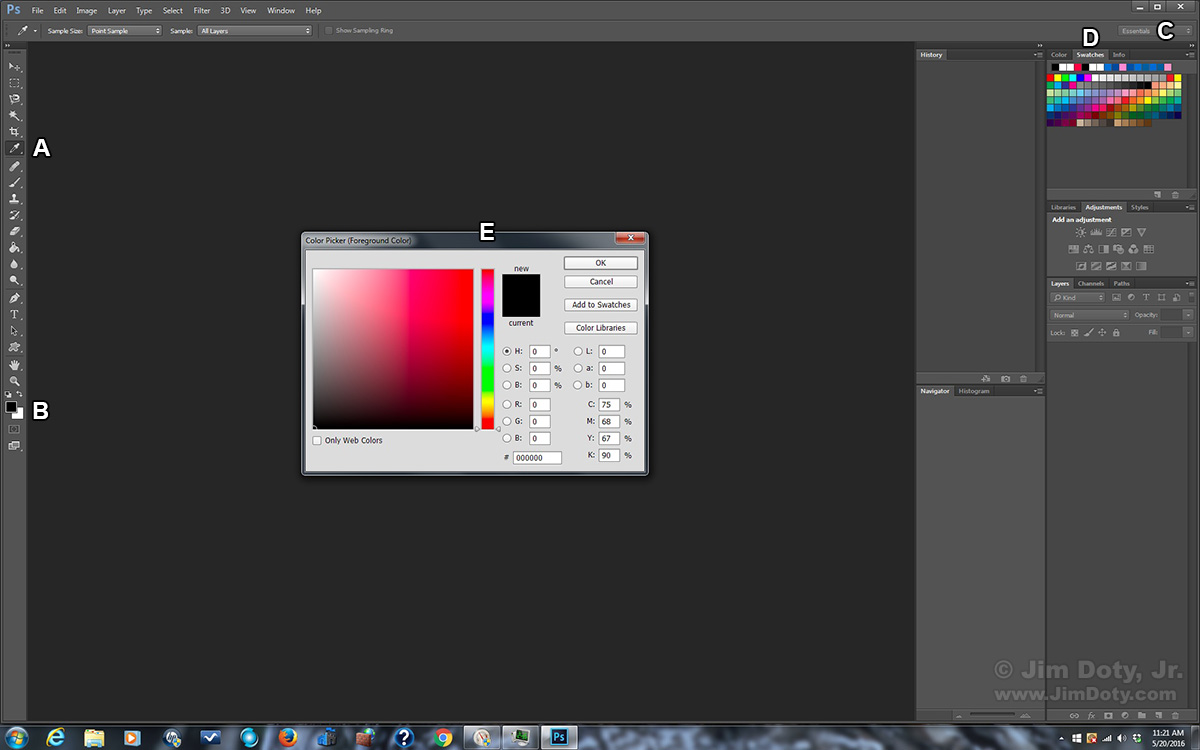
This is the basic (default) Photoshop layout. It can be customized. Photoshop has several readily accessible color selection tools. Toward the top of the tools palette on the left side of Photoshop is the Eyedropper Tool (marked with the letter A). Toward the bottom of the tools palette is the Foreground/Background tool (B). More about that tool in a minute. At the upper right in the drop down menu choose the Essentials workspace (C) to bring up the palettes on the right. Choose the Swatches palette (D). If you click on the black Foreground Square (B) you will bring up the Color Picker (E).
Customizing Palettes in the Workspace
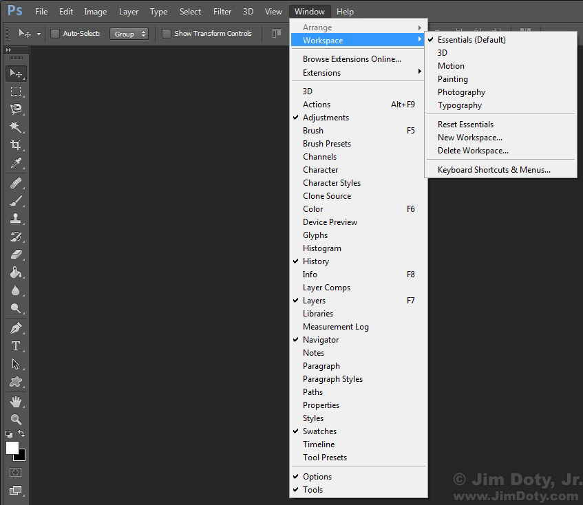
In addition to the drop down menu at the upper right, you can access the workspace options from the Photoshop menu by going to Windows > Workspace. Each workspace has a default set of palettes. You can customize your workspace by turning on and off the palettes in the list. For example if you prefer a workspace other than Essentials that doesn’t include the Swatches palette (like Photography for instance) and you want to add the Swatches palette, just click on Swatches on the list of palettes. A check mark will appear in front of Swatches and the Swatches palette will show up among the palettes on the right.
The Foreground/Background Tool
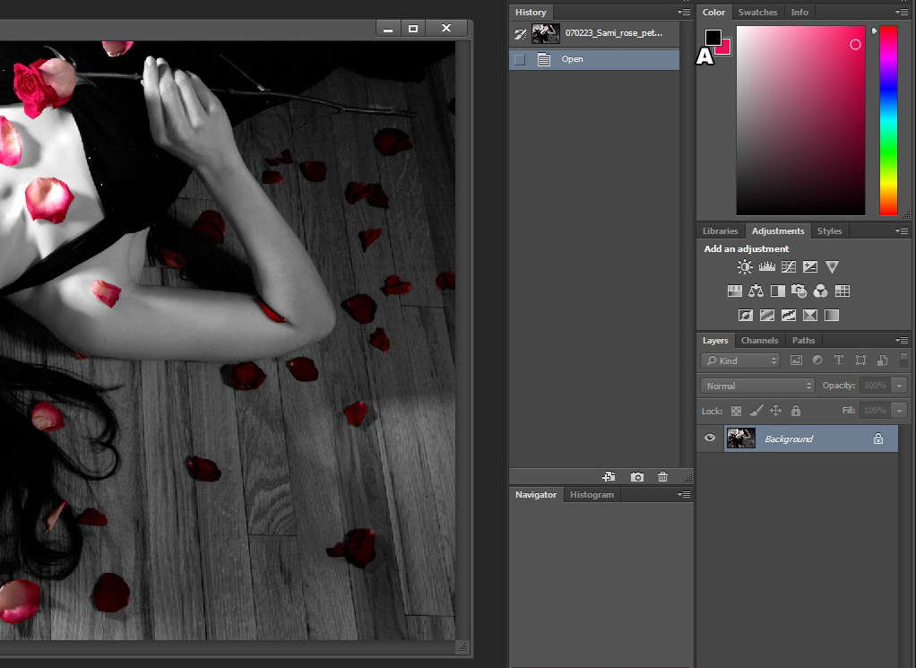
The Foreground/Background tool is right below the Hand and Zoom (magnifying glass) tools. The default colors are black for the foreground (A) and white for the background (B). To restore the default colors, click the mini-overlapping squares (C). To swap the foreground and background colors, click the curved arrow (D).
If you click on the foreground color (A) it will bring up the Color Picker and you can choose a new foreground color with the Color Picker (more about this later). Click on the background color (B) to change it.
FYI, if you click the Type tool (looks like the letter T) to add text to a photo or painting, the foreground color will be the color you type with. Change the foreground color to change the typing color.
Using the Eye Dropper Tool (A)
By default, the Eye Dropper tool changes the background color. You can temporarily change this behavior by holding down the Option/Mac or Alt/Windows key while you use the Eye Dropper. Doing that will change the foreground color.
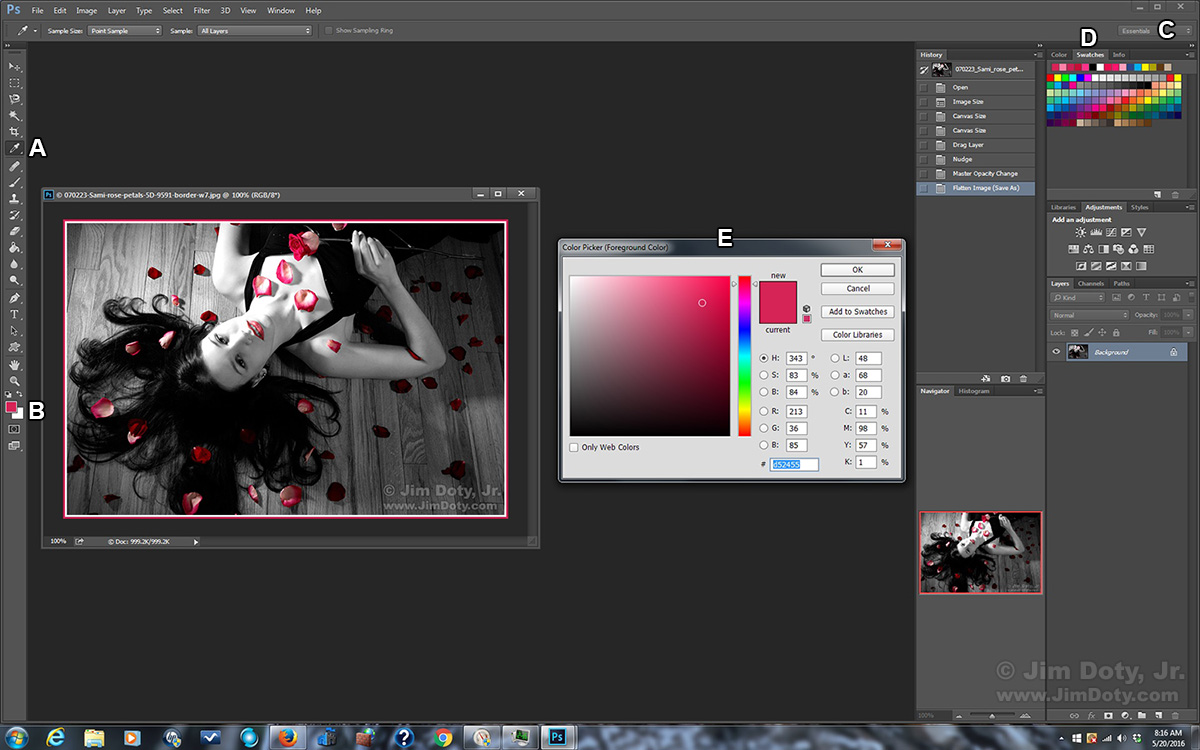
Choose the Eye Dropper tool (the cursor will turn into an eye dropper when it is over a photograph) and click on a color in your photograph. That color will become the new background color. In the photo of Sami with rose petals I used the Eye Dropper tool and Option/Alt clicked on the bright red part of the rose in her hand. This reset the foreground ground color to the color of the rose petal. Then I used white and the new foreground color to make a double border around the photograph. I wanted the outer border to be an exact match for the color of the rose.
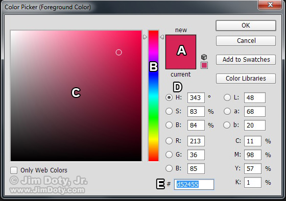
To check the Photoshop values for the new color, I clicked on the new foreground color (B)Â to bring up the Color Picker (E). The HSB values are 343, 83, 84. We know from the color wheel at the bottom of the last article that an H value of 343 is about half way in between Magenta-Red and Red. The saturation and brightness values are both reduced. The RGB values are 213, 36, 85.
You can also use the Eye Dropper tool to choose a color from the Swatches palette (D). Click on the color with the Eye Dropper and it will become the new background color.
As a handy convenience, any tool when used over the Swatches palette becomes the Eye Dropper tool.
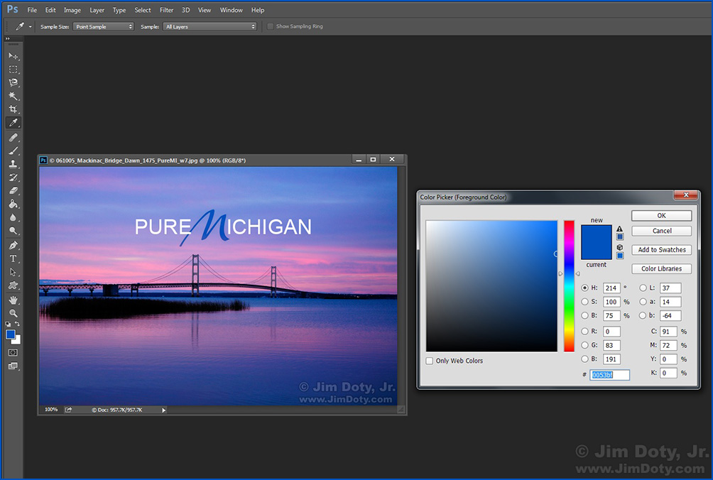
For this image I wanted the letter M in the text to match the dark blue of the water toward the bottom of the photo. I used the Eye Dropper and clicked the water to make that the foreground color. I used that color to make the stylized M and white for the rest of the letter.
Changing the Eye Dropper Tool’s Foreground/Background Preference
To change the Eye Dropper’s preferred behavior, choose the Color palette (next to the Swatches palette). You will see a stripped down version of the Color Picker with the same small Foreground/Background squares (A) that are in the tools palette. Click on the foreground square. The Eye Dropper will now change change foreground colors every time you use it. To switch the Eye Dropper’s preference back to the background, go back to the Color palette and click on the background square.
The Eye Dropper and the Info Palette
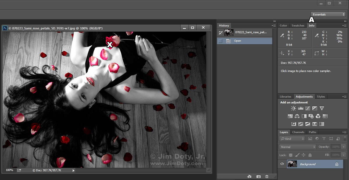
Choose the Info Palette (A) upper right. Then move the eye dropper tool over a photograph and watch the data change in the Info palette. You get a constant readout of the RGB and CMYK data of the pixel under the Eye Dropper tool as you move across the photo. With the eye dropper over the red rose (X) the RGB values are 233, 40, 107 and the CMYK values are 2, 96, 35, 0. Before even using the Eye Dropper tool you would expect the Red and Magenta values to be high. As you move the Eye Dropper over the red part of the rose you will see a lot of different but closely related values. Though all within the red-magenta family of hues there are a lot of different tonal values in each rose petal.
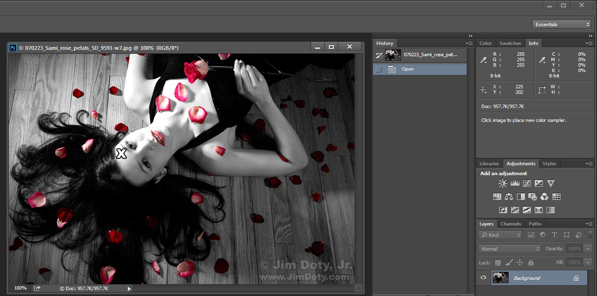
With the Eye Dropper over the brightest part of the forehead (X) the RGB values are all at their maximum, 255, 255, 255. This is pure white. As expected, the CMYK values are all at 0, as in no colored ink or pigments are needed to print this part of the image.
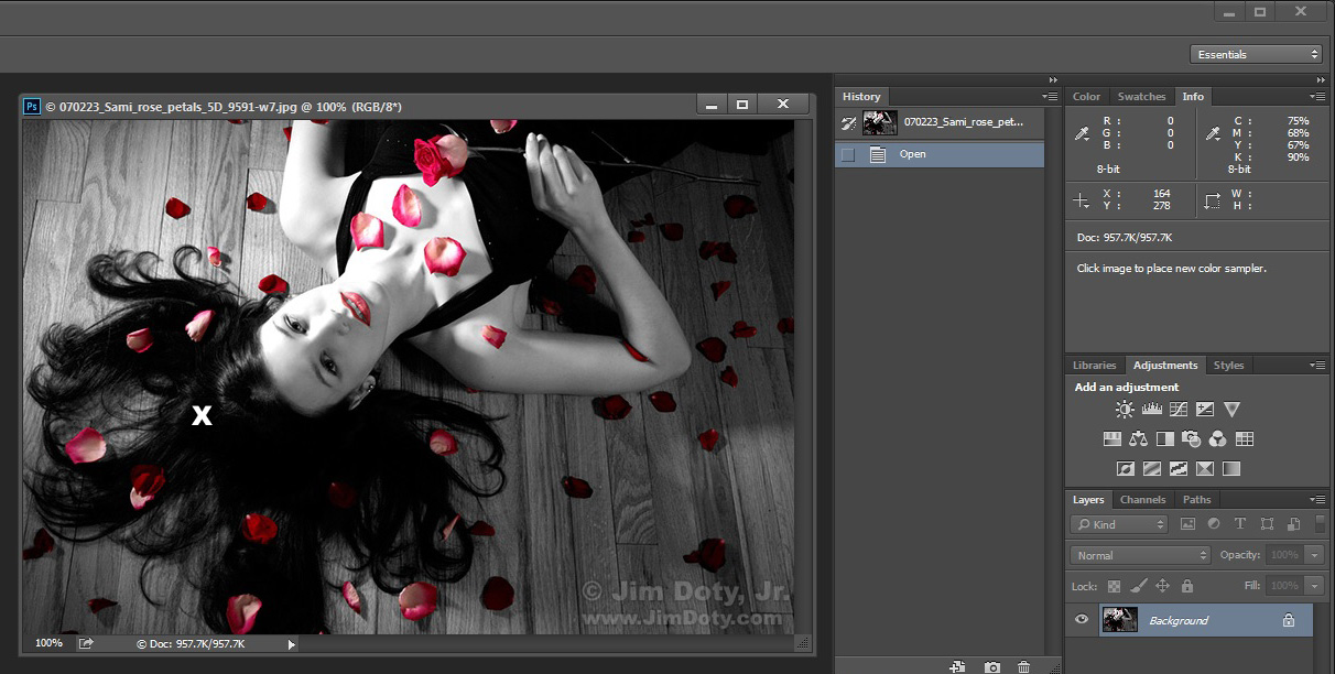
With the Eye Dropper over the darkest part of the hair (X) the RGB values are all at their minimum, 0, 0, 0. Pure black. CMYK values are high. It takes a lot of ink/pigments to create black on white printing paper.
The Info Palette will provide this information no matter which tool you have selected, but you need to use the Eye Dropper tool if you want to sample the color the Eye Dropper is over and make it the background or foreground color.
The Info Palette Coordinate System
The X,Y coordinates directly under the RGB information tell you the exact location of the tool in the photograph. X and Y tell you how far you are from the top left corner of the photo. The default setting is for pixels. If X=27 and Y=265 you are at the 27th pixel from the left and the 265th pixel from the top. Using the drop down menu, you can change to coordinates to inches, centimeters and other options.
Using the Color Picker
Click on the foreground or background squares (B) to change that color with the Color Picker (E). To do that numerically, enter new values for HSB, RGB, LAB, or CMYK.
HSB and RGB were explained in the prior tutorial. Unlike the online color picker, Photoshop has two additional value systems. CMYK and LAB color.
CMYK (Cyan, Magenta, Yellow, and K for Black) are the colors (inks or pigments) used in printing photos. In RGB terms white is 255, 255, 255 (the maximum values). In CMYK terms white is 0,0,0,0 (because no ink is needed to create white on white printing paper). For all practical purposes, if you are sending photos to your own printer, Photoshop and/or the printer does the RGB to CMYK conversion for you. The same is true for sending photos off to your favorite photo lab. When you are using the color picker and entering HSB or RGB values you can watch the CMYK values change automatically. But you may run into one of those rare situations where precise CMYK values are important so you can set them directly. If that is the case, the printer (as in a human being) who will be setting your photos up for printing on a CMYK press will give you specific information. CMYK is complicated and it helps if you have a lot of background information. See the books below by Dan Margulis. For most photographers the need to work in CMYK is rare.
LAB Color (also written L*a*b* or CIELAB) is a very powerful colorspace. L stand for Luminance or Lightness. A and B stand for color channels. The A channel is green-magenta and the B channel is blue-yellow. The number 0 (zero) in either channel is neutral gray. Plus or minus values from zero give you the four color values for the two channels. Working in LAB Color feels akin to using the Temperature (blue-yellow) and Tint (green magenta) sliders in Adobe Camera Raw. Working in LAB Color is very different from working with the RGB color space which is why most photographers spend their time in RGB mode when working in Photoshop. That is a shame. There are some things LAB Color can do with some photos that are harder if not impossible to with RGB Color. If you are super serious about color quality in your images, learning to use LAB Color is well worth your while. The best way to learn is the book Photoshop LAB Color by Dan Margulis (check out the links at the end of this article). In the Color Picker you won’t need to enter numerical values for LAB until you learn LAB color.
The bottom line is you will mostly enter specific numerical values for HSB, RGB and LAB if you decide to learn the LAB Color system.
This is the Color Picker after I selected the color of the rose in the photo at the beginning of this article. The square labelled A is the the foreground color after I used the Eye Dropper to select the color. You can see the numeric values of the four color systems the Color Picker keeps track of. If I wanted to duplicate this color again (I rarely need to do that) all I would need to do is enter the numeric values for one of the color systems. If you think you might need to reproduce a color, do a quick screen capture of the color picker and save it with the photo the color came from.
The color bar in the middle (B) has the full range of color hues (from 0 to 360 degrees) in Photoshop, but only if you select the H radio button near the letter D. Click anywhere in this bar to select the Hue you want (or drag the diamonds on either side of the color bar up and down). Once you have picked a new hue, in the large square (C) the Color Picker will show you all the saturation and brightness (S & B) variations for that particular hue. This is clearly most closely related to the HSB color settings. This is the fastest way to visually choose any color in the rainbow. When you see the color in the large square that you want, click on it to make that the new foreground or background color. The Color Picker will show you all the numerical values for that color in all four color systems.
To save your new color to the Swatches palette just click on the Add to Swatches button.
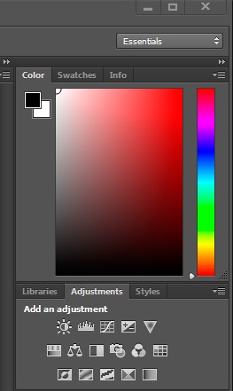 There is one other way to visually choose a color. Go to the Color palette (you’ve seen this before, choose a hue from the color bar on the right, then choose the variation of the hue you want by clicking in the large square. This works the same as using the color picker except you don’t get any numerical values. But for a quick and simple color selection it works just fine.
To sum up the basics of color selection, to numerically select a color you need to use the Color Picker. To visually choose a color you can use the Eye Dropper to pick a color from a photo or from the Swatches palette. Or you can visually choose a color from the Color Picker or from the Color palette.
There are a lot more ins and outs to color selection and you can learn advanced techniques in the books linked below.
Series Links
“How To” Series: Photoshop’s Color Tools and Systems
Learning Photoshop Colors – A Color Picker Tutorial
Tutorial: Using Photoshop’s Color Selection Tools
How to Create Your Own Photoshop Color Wheel
Article Link
The Best Digital Photography Books
Book Purchase Links
If you want to master color in Photoshop, these are the books to get. Click on a title link to buy the book from Amazon.com via my photography store.
Professional Photoshop: The Classic Guide to Color Correction (5th Edition) by Dan Margulis.
Dan Margulis is the best of the best. He is one of the first three persons to be named as a member of the Photoshop Hall of Fame. What Margulis teaches you to do with color is amazing. The before and after images will make your jaw drop.
Scott Kelby, President of the National Association of Photoshop Professionals, says “Dan Margulis is the world’s leading expert on Photoshop Color. Professional Photoshop is considered to be the bible on color correction and prepress.â€
David Biedney, author of Photoshop Channel Chops, says “Dan Margulis is simply the best writer in the computer graphics field today, and his staggering knowledge of working with imagery in Photoshop and getting the results onto paper is unmatched by any self proclaimed ‘Photoshop Guru.’ He has an amazing sense of humor, arrives to the point in the most entertaining and comprehensive ways, yet never wavers from the task of teaching you how to think better.”
This wonderful book is out of print but you can still get it from Amazon. Just click on the link above to the book and use the Buy at Amazon button.
Photoshop LAB Color: The Canyon Conundrum and Other Adventures in the Most Powerful Colorspace (2nd Edition) by Dan Margulis
Why get this book?
David Biedny, author of Photoshop Channel Chops, called Photoshop LAB Color “probably the most important Photoshop book ever written.â€
Scott Kelby, President of the national Association of Photoshop Professionals, wrote “This book will radically change how we do color correction . . . it’s that revolutionary.â€
This is the second edition. You can also get the first edition on the used market from Amazon.
Adobe Photoshop Master Class (2nd Edition) by John Paul Caponigro. John Paul Caponigro is a master at photography and Photoshop and one of the best when it comes to color and Photoshop artistry. If you want to adjust colors to turn your photographs into works of art, this is the book to get. Click on the Buy at Amazon button to buy this out of print book from one of Amazon’s third party sellers.
This is another wonderful out of print book that you can get from Amazon’s third party sellers. just click on the book link and choose the Buy at Amazon button.
These books and a lot more are all available in the Mastering Photoshop and Lightroom section of my Amazon.com powered photography store. You get the same great Amazon prices, fast delivery, excellent service, and guarantee. And you help support my photography sites. Thanks.


