Your camera is in love with middle gray. The quicker you learn how to deal with this infatuation, the better your photos will look, including all of your color photos.
“Middle gray” is about half way in between black and white. Your camera meter loves middle gray so much that it tries to turn everything into middle gray (in the black and white or “grayscale” world), no matter how light or dark your subject really is. The reason your camera does this (the actual, technical reason) is the manufacturer calibrated your camera meter to make everything middle gray (or a “medium tone” in the world of colors). That makes perfect sense of course, it is a nice average tonality to use. It wouldn’t make sense for your camera to try to make everything white or black. The problem is individual subjects or scenes are often much lighter or darker than middle gray, so your camera meter gets fooled.
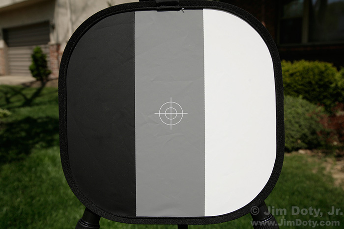
This is a black, gray, and white calibration target. This photo is how it looks in real life. I zoomed in on the “middle gray” panel in the middle of the target, metered it, locked in that exposure reading, zoomed back out and took the picture. The background behind the calibration target also looks just like it did in real life.
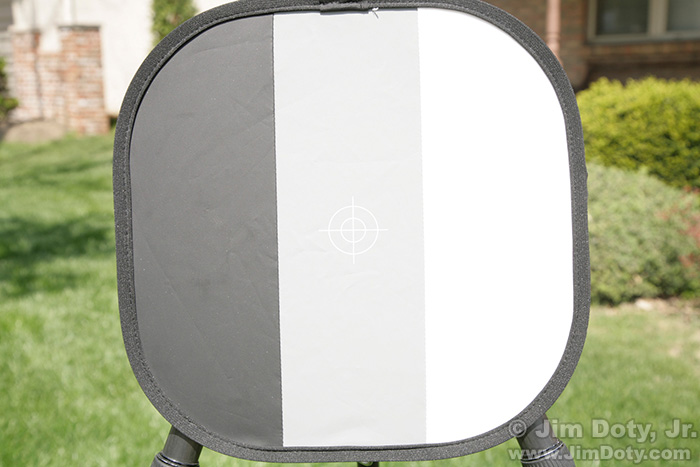
But what if I metered the black panel on the left side of the calibration target?
For this photo I metered the black panel. The camera did its best to turn the black panel a middle gray and it succeeded. The background around the calibration target is much lighter than it was in real life.
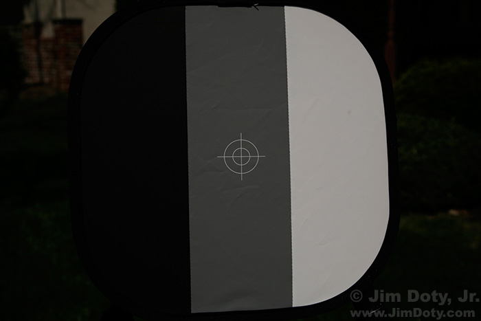
Next I will meter the white panel. You know what’s coming.
The camera meter again did its best to make the white panel a middle gray tone, and did a good job. The background around the calibration is much darker than it was in real life.
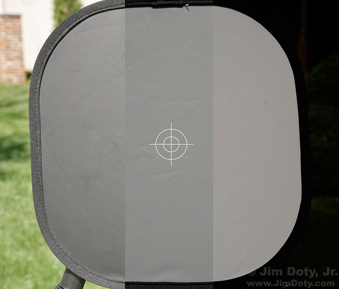
Just to show you how well the camera meter did its job, I spliced parts of the three calibration target photos together, in each case using the part of the calibration target that I metered.
So, your camera loves middle gray. What does that have to do with your photography? And especially color photography?
If you meter something in your scene that is middle gray, everything in your photograph will look like it does in real life, including light and dark tones. If you meter something that is darker than a middle gray, everything in your photo will be lighter in tone than it is in real life. If you meter something that is lighter than a middle gray, everything in your photo will look darker than it is in real life. Let this paragraph sink in.
I will put it another way:
If you meter something in a scene that is too light, your photo will be too dark. If you meter something in the scene that is too dark, your photo will be too light.
Most camera meters are color blind. They meter the intensity of the light and then convert the light intensity into a “medium tone”, the color equivalent of middle gray. Camera meters that see in color also measure the intensity and color of the light and convert the light intensity into a -surprise, surprise – medium tone. So if you meter something that is a dark red, in your photo the red will become a medium toned red. Meter a light, pale pink and it becomes a medium toned pink. Light yellow becomes a medium toned yellow.
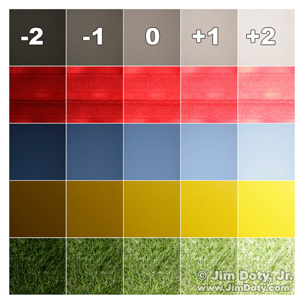
The colors in the middle column (with a zero at the top of the column) are all medium toned. These are the tones your camera is calibrated to produce. If you photograph a dark red, richly colored napkin (top row, first column) your camera meter will turn it into a medium toned, less saturated red (middle column). If you photograph a light yellow bowl (row three, far right column) the camera will make it a medium toned, dingy (muddy) yellow (middle column).
If you meter anything that is lighter or darker than a middle gray/medium tone, your camera meter will miss the correct exposure (and your colors will suffer – more about that later).
You can solve this problem in several ways. One way is to use exposure compensation with your camera’s meter. If you meter a subject that is darker than a medium tone, you take away light by using minus exposure compensation. If you meter a subject that is lighter than a medium tone, you add light by using plus exposure compensation. The Exposure Compensation Tonality Chart above shows what gray, red, blue, yellow, and green look like with plus or minus exposure compensation in one stop increments from -2 to +2. You can learn all the details for using exposure compensation in Using Reflected Light Meters, Part One. (The meter in your camera is a reflected light meter.)
Another solution is to carry an 18% gray card with you and use it properly. It will work just like the gray panel in the Calibration Target above. The 18% gray card is your middle gray standard of reference. You will get great exposures. Just read How to Use an 18% Gray Card.
A third option is to use a handheld incident light meter. It is one of the most accurate ways to meter, but also the most expensive since you have to buy a separate meter. Read Simplify Your Life with an Incident Light Meter.
Why not just fix the exposures that are off by using image editing software? Because your colors will suffer. One of the professional secrets to great colors is great exposures. If you miss the ideal exposure by more than 1/2 stop, the colors in your photos will shift in different directions. You can adjust the lightness or darkness (exposure) of your photo with image editing software, but you can’t get the right colors back. Since bad exposures cause the colors to shift in different directions, if you correct one color with image editing software, the other colors will get even worse. The only way to get the best colors in your photos is to get the exposure right. If you want the best colors your digital camera is capable of producing, you have to nail the exposure. You can learn more in The Best Colors Come from the Best Exposures.
As an example, just about everything in the photo of Sarah at the top of this article is lighter or darker than a middle gray. I used her left shoulder as the basis for my exposure. Her shoulder is about 1 1/3 stops lighter than middle gray, so I set my studio lights to make her shoulder about 1 1/3 stops lighter than a middle gray.
Sarah, Photo Data: Canon 5D Mark III. Canon EF24-105mm f/4L IS USM at 55 mm. 1/125 sec, f/8, ISO 100. AlienBees studio lights bounced out of white umbrellas.
(Originally posted January 12, 2015. Updated and re-posted November 12, 2015.)
Links
Using Reflected Light Meters, Part One
Using Reflected Light Meters, Part Two
How to Use Your Camera’s Exposure Compensation Scale
Simplify Your Life with an Incident Light Meter
The Best Colors Come from the Best Exposures
To master exposure read Digital Photography Exposure for Dummies. It is one of the highest rated photography books at Amazon.com. It is not just another Dummies book. It covers basic, intermediate and advanced exposure techniques all in one book, so you don’t have to go buy another book when you’ve mastered the basics. Learn more about the book here and order it at Amazon.com.


